How to Build an Interactive Progress Tracker with HTML, CSS, and JavaScript
| Live Demo |
In this tutorial, I'll walk you through creating a beautiful, responsive progress tracker that updates as users complete lessons. This UI component is perfect for online courses, learning platforms, or any application where you need to track completion progress.
What We're Building
We'll create a progress tracker with:
-
A dynamic progress bar with percentage
-
A list of lessons that can be marked complete/incomplete
-
Smooth animations and transitions
-
Fully responsive design
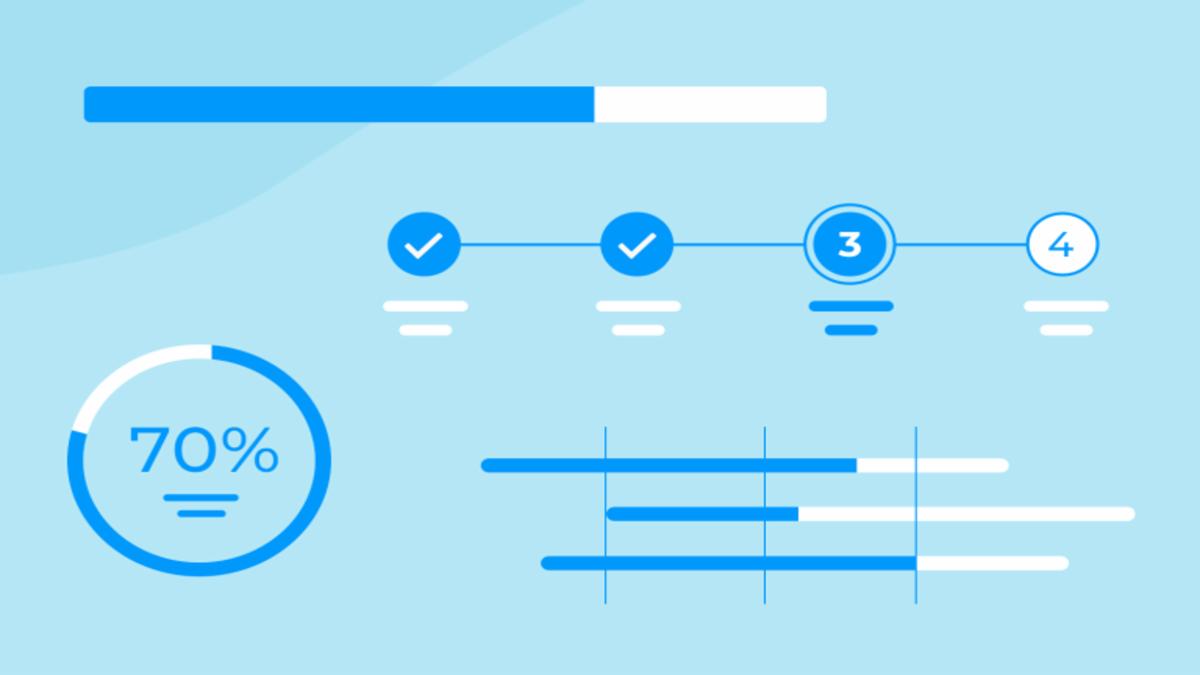
Here's the final result: [Insert screenshot or GIF of the working component]
Step 1: Set Up the HTML Structure
First, let's create the basic HTML structure. We'll use Tailwind CSS for styling, which we'll include from a CDN.
<!DOCTYPE html>
<html lang="en">
<head>
    <meta charset="UTF-8">
    <meta name="viewport" content="width=device-width, initial-scale=1.0">
    <title>Progress Tracker</title>
    <script src="https://cdn.tailwindcss.com"></script>
    <link rel="stylesheet" href="https://cdnjs.cloudflare.com/ajax/libs/font-awesome/6.4.0/css/all.min.css">
</head>
<body class="bg-gray-50 min-h-screen py-12 px-4 sm:px-6 lg:px-8">
    <div class="max-w-3xl mx-auto">
        <!-- Progress Card and Lessons will go here -->
    </div>
</body>
</html>
Step 2: Create the Progress Card
Inside the main container, we'll add the progress card that shows the overall completion status.
<div class="text-center mb-10">
    <h1 class="text-3xl font-bold text-indigo-700 mb-2">Your Learning Journey</h1>
    <p class="text-gray-600">Track your progress as you complete each lesson</p>
</div>

<!-- Progress Card -->
<div class="bg-white rounded-xl shadow-md overflow-hidden mb-8 transition-all duration-300 hover:shadow-lg">
    <div class="p-6 sm:p-8">
        <div class="flex justify-between items-center mb-4">
            <h2 class="text-xl font-semibold text-gray-800">Course Progress</h2>
            <span class="text-indigo-600 font-medium" id="progress-percentage">0%</span>
        </div>

        <!-- Progress Bar -->
        <div class="w-full bg-gray-200 rounded-full h-4 mb-6">
            <div id="progress-bar" class="h-4 rounded-full bg-gradient-to-r from-indigo-500 to-purple-600" style="width: 0%"></div>
        </div>

        <div class="flex justify-between text-sm text-gray-500">
            <span>0 lessons completed</span>
            <span id="total-lessons">5 lessons total</span>
        </div>
    </div>
</div>
Step 3: Add the Lessons List
Below the progress card, we'll add the list of lessons that users can mark as complete.
<div class="space-y-4">
    <h3 class="text-lg font-medium text-gray-800 mb-2">Lessons</h3>

    <!-- Lesson 1 -->
    <div class="lesson-item bg-white rounded-lg shadow-sm p-5 border border-gray-100 cursor-pointer" data-completed="false">
        <div class="flex items-center justify-between">
            <div class="flex items-center space-x-4">
                <div class="checkmark w-6 h-6 rounded-full border-2 border-gray-300 flex items-center justify-center">
                    <i class="fas fa-check text-white text-xs"></i>
                </div>
                <div>
                    <h4 class="font-medium text-gray-800">Introduction to HTML</h4>
                    <p class="text-sm text-gray-500">Learn the basics of HTML structure</p>
                </div>
            </div>
            <span class="text-sm text-gray-400">15 min</span>
        </div>
    </div>

    <!-- Add more lessons following the same pattern -->
</div>
Step 4: Add Custom CSS for Animations
While Tailwind handles most styling, we'll add some custom CSS for smooth transitions.
<style>
    .progress-bar {
        transition: width 0.5s ease-in-out;
    }
    .checkmark {
        transition: all 0.3s ease;
    }
    .lesson-item:hover {
        transform: translateY(-2px);
        box-shadow: 0 4px 6px -1px rgba(0, 0, 0, 0.1);
    }
</style>
Step 5: Implement the JavaScript Functionality
Now let's add the JavaScript that makes our progress tracker interactive.
<script>
    document.addEventListener('DOMContentLoaded', function() {
        const lessonItems = document.querySelectorAll('.lesson-item');
        const progressBar = document.getElementById('progress-bar');
        const progressPercentage = document.getElementById('progress-percentage');
        const totalLessons = lessonItems.length;
        document.getElementById('total-lessons').textContent = `${totalLessons} lessons total`;

        let completedCount = 0;

        lessonItems.forEach(item => {
            item.addEventListener('click', function() {
                const isCompleted = this.getAttribute('data-completed') === 'true';

                if (isCompleted) {
                    // Mark as incomplete
                    this.setAttribute('data-completed', 'false');
                    this.querySelector('.checkmark').classList.remove('bg-indigo-600', 'border-indigo-600');
                    this.querySelector('.checkmark').classList.add('border-gray-300');
                    completedCount--;
                } else {
                    // Mark as completed
                    this.setAttribute('data-completed', 'true');
                    this.querySelector('.checkmark').classList.add('bg-indigo-600', 'border-indigo-600');
                    this.querySelector('.checkmark').classList.remove('border-gray-300');
                    completedCount++;
                }

                updateProgress();
            });
        });

        function updateProgress() {
            const percentage = Math.round((completedCount / totalLessons) * 100);
            progressBar.style.width = `${percentage}%`;
            progressPercentage.textContent = `${percentage}%`;

            const completedText = document.querySelector('.flex.justify-between.text-sm.text-gray-500 span:first-child');
            completedText.textContent = `${completedCount} ${completedCount === 1 ? 'lesson' : 'lessons'} completed`;

            if (percentage === 100) {
                progressBar.classList.add('animate-pulse');
                setTimeout(() => {
                    progressBar.classList.remove('animate-pulse');
                }, 2000);
            }
        }
    });
</script>
How It Works
-
Initialization:
-
We select all lesson items and progress elements when the DOM loads
-
We count the total number of lessons and display it
-
-
Click Handling:
-
Each lesson item has a click event listener
-
When clicked, we check if it's already completed
-
We toggle the completed state and update the checkmark appearance
-
-
Progress Calculation:
-
The
updateProgress()function calculates the completion percentage -
It updates the progress bar width and percentage display
-
It also updates the "X lessons completed" text
-
-
Celebration Effect:
-
When progress reaches 100%, we add a pulse animation to the progress bar
-